I shared with you my New Year’s resolutions several weeks ago. One of them was to learn calligraphy. I had a lesson several months ago, but before I could go to step two, I had to practice, practice, practice. Well needless to say, I have not had the next lesson. Our teacher said that we should practice lettering every day, even if we only have a few minutes, until it becomes natural. I am in awe when I watch her pen move on the paper and see the decorative letters that form.
Maybe it is my love of history that makes me want to learn calligraphy or my love of pen and ink. In our magazine Entertain Decorate Celebrate, there is a delightful article on calligraphy that I am sharing with you today.
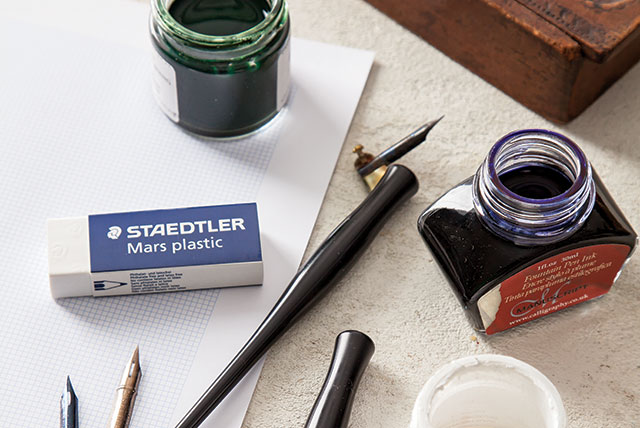
The Essentials
To get started, you’ll need a pointed nib, a straight holder, an oblique holder, a variety of inks, bleedproof marker paper, and, of course, a good eraser!
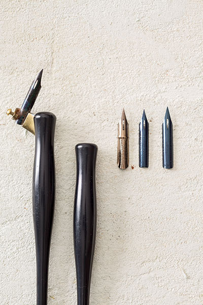
Choose a nib and a nib holder. Nib holders come oblique or straight. I use straight, but oblique helps some people get the angle of the nib right. My favorite nib is the Brause EF66, but a Nikko G, which is less flexible, might be more suitable for a beginner.
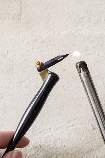
Place the nib in the holder, and then burn the nib with a lighter for a second or two to take off the chemical residue. (The residue keeps the ink from sticking to the nib.)
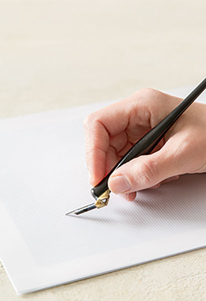
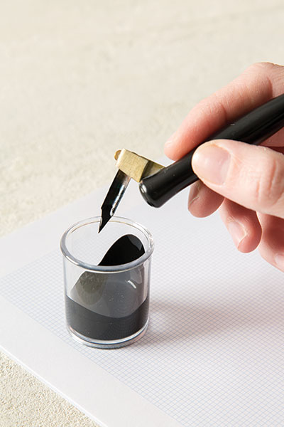
Dip your nib in ink (beyond the well or the opening in the middle of the nib), and begin with some practice strokes.
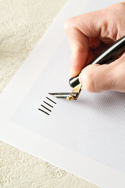
Start with downstrokes—little parallel lines going straight down. With the downstroke, you put pressure on the nib so that it creates a heavy line. The tines of the nib should separate to do this. Try some curved downstrokes.
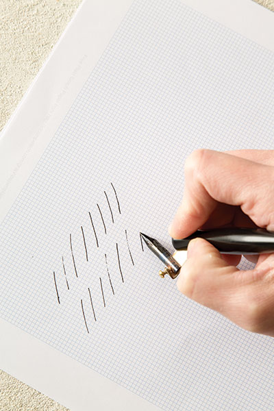
Now try upstrokes (you should use absolutely no pressure). This creates hairlines, or very thin lines. Diagonal bottom left to upper right is a good upstroke to try.
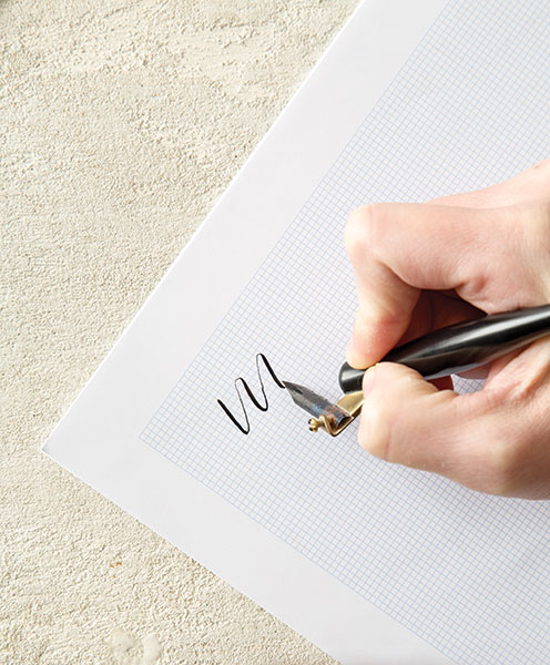
Now combine downstrokes and upstrokes to get the feel of actually forming letters. A wavy line is a good example. Or a curlycue. Repeat, repeat, repeat—that is the only way to get comfortable with the pen.
Once you feel comfortable with your downstrokes and upstrokes, you can try creating letters. I like to start beginners with a very basic, traditional alphabet and let them expand from there.
Have you tried calligraphy? I’d love to hear your stories!

Get the latest issue!